Image with logo and a laptop with the NIPOCAR website

My journey at NIPOCAR

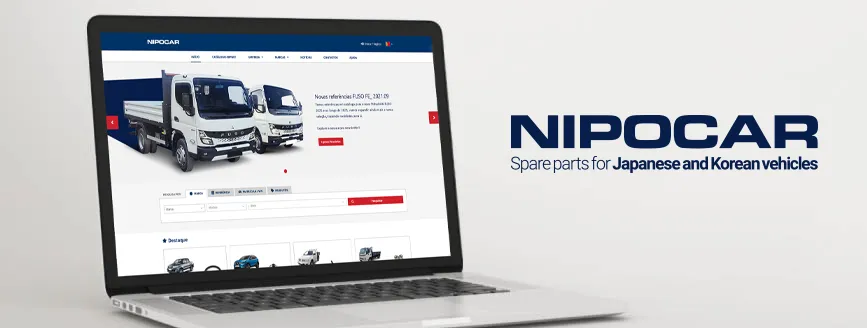
Between 2023 and 2025, I worked at NIPOCAR as a multidisciplinary designer (UX, brand and digital communication), contributing to website improvements, product communication, and brand consistency across digital and physical channels.

When I joined, there was no dedicated UX structure for the company's digital products. As I became more familiar with the business and its users, my role evolved into identifying usability issues, improving clarity for both customers and internal teams, and supporting product and communication design with a user-centered approach.

About NIPOCAR

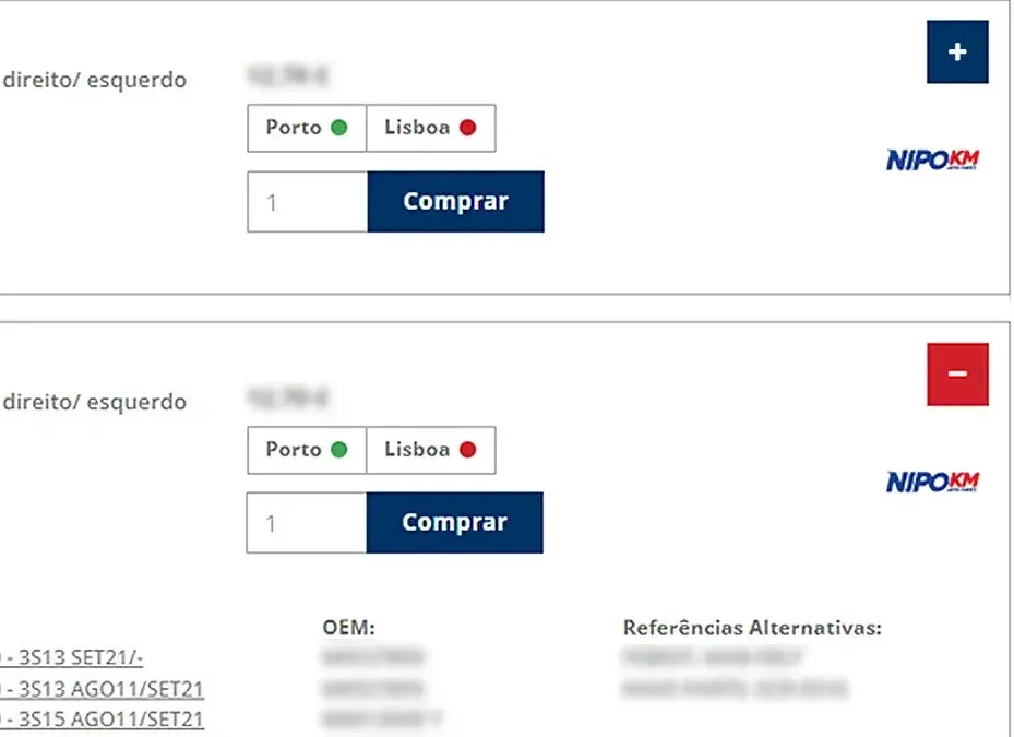
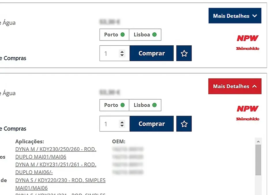
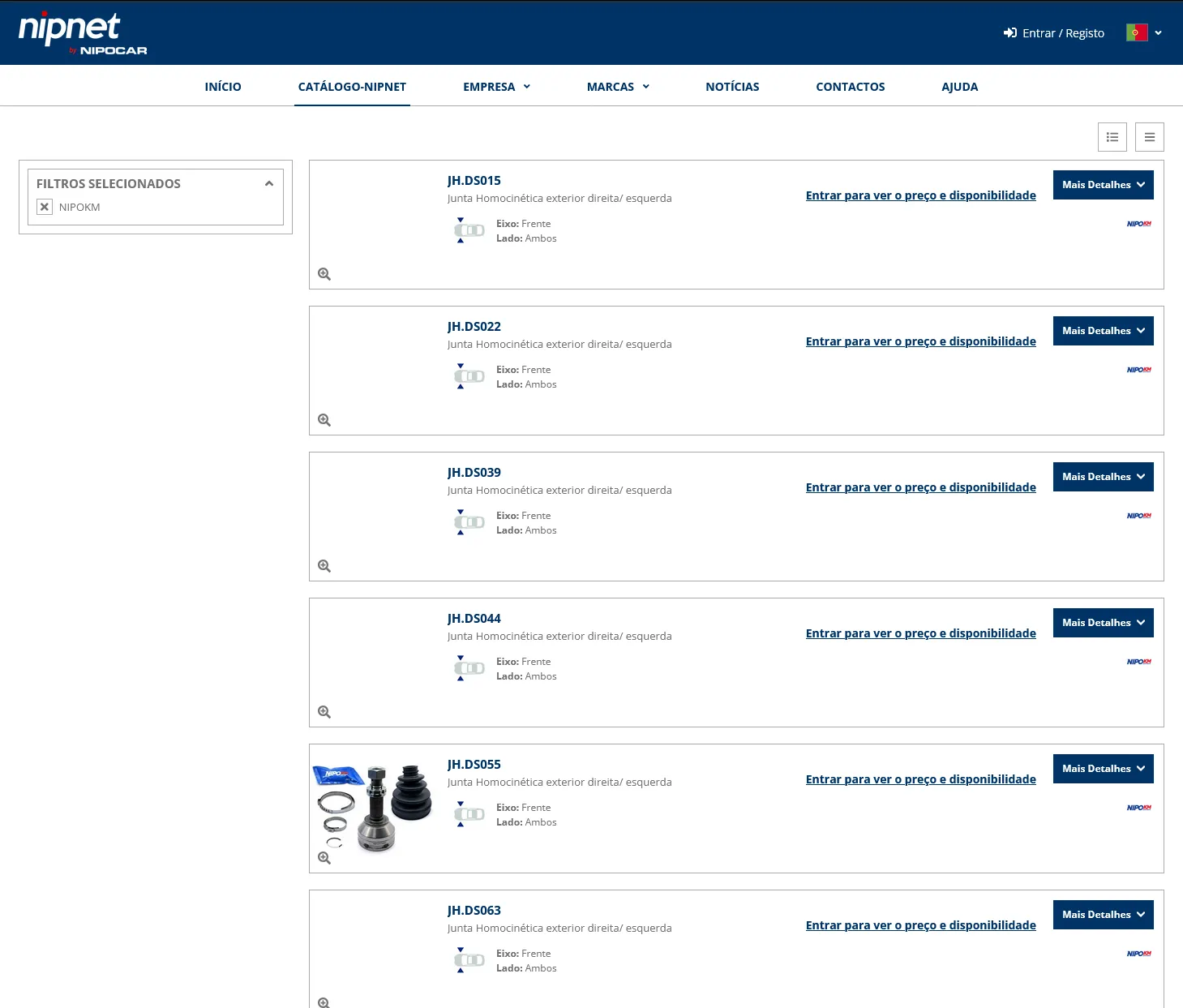
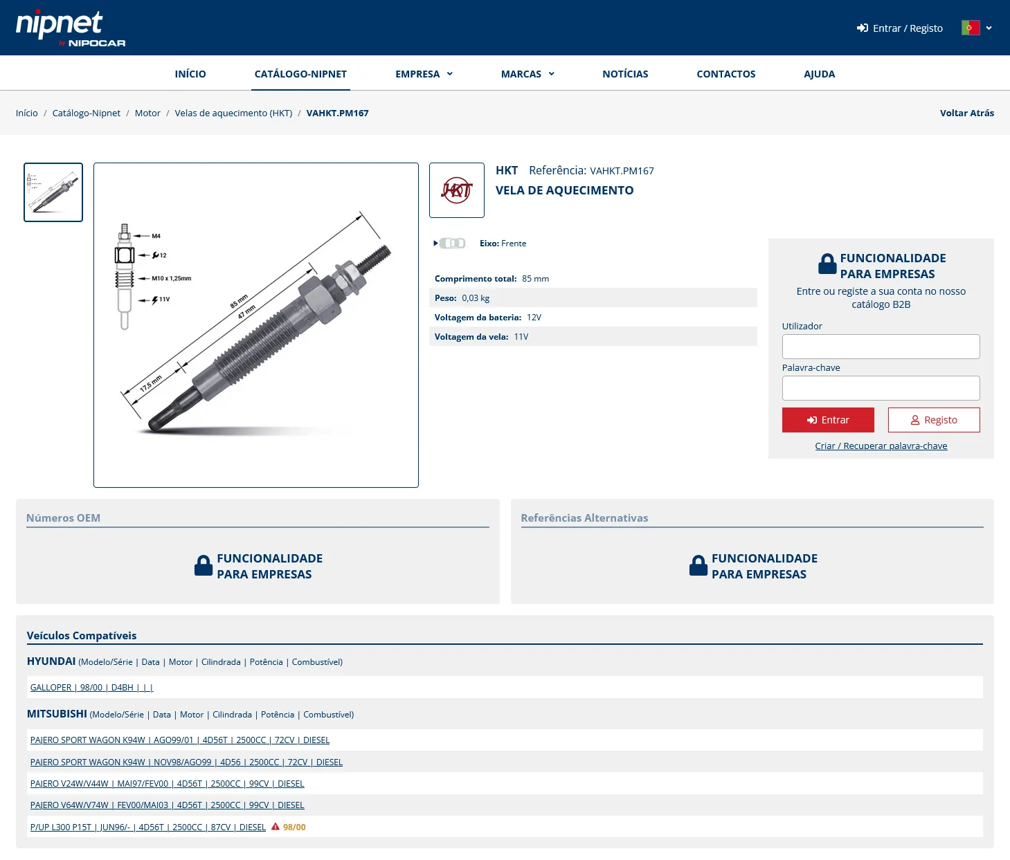
NIPOCAR is a B2B company focused on importing and distributing aftermarket vehicle spare parts, primarily for Japanese and Korean vehicles. Its main users are spare parts shops.

The company also owns the NIPOKM brand, offering a wide range of spare parts, ranging from suspension, clutch and engine components to general wear parts.

UX and website improvements

Website analysis

As I started navigating the website and learning about the different users interacting with the platform, I took notes based on the Nielsen's heuristics to help me identify what could be better and what was not working.

This process led me to define two initial users with different goals and backgrounds: my internal colleagues and spare parts shop owners.

Aftersales feature - user journey

While testing the aftersales website feature from both user perspectives, I encountered frequent friction points such as unclear error messages, dead ends and missing feedback

I also observed an aftersales colleague using the feature in real conditions to better understand where confusion and errors occurred.

When a phone call became easier than submitting the form, it was clear the feature was failing both internal and external users.

Design recommendations

Based on the analysis and user observations, I proposed to fix the aftersales flow, improving system feedback and error messaging such as “File size exceeds limit”, adding useful input text fields and clarifying the information required from users to reduce friction, failed submissions and unknown errors.

Further iterations and implementation continued beyond my involvement in the project.

Interaction and copy issues

I became aware of several interaction and microcopy issues as I was getting more familiar with the website, one particularly critical issue was a button that opened the product's technical information and was labelled with a "+" when closed and "-" when opened.

Image showing the button before
  • This button was confusing users who needed more technical information, often leading them to call customer support instead.

Implemented changes

After researching and speaking with users, I identified key interaction issues and proposed feature improvements.

Further iterations and implementation continued beyond my involvement in the project.

Image showing the button after
  • These changes reduced support calls and clarified actions for both internal staff and customers.

Reporting with JIRA tickets

Soon after I started to talk with my colleagues, researching and testing and identifying what needed to be tested, reviewed or analysed, the company started to use a JIRA ticket system to let our colleagues also identify issues or errors they noticed.

It also helped to organize what had the highest priority to meet with the dev team and present our solutions accordingly.

Meeting the shop owners

I joined the sales team on field visits to better understand how shop owners interacted with the website catalogue and the sales process itself.

Before the visits, I organised a set of key questions based on stakeholder assumptions and internal doubts, particularly regarding the importance of product photos and the need for fast and clear technical information. This helped structure the conversations and validate how these elements influenced shop owners when identifying and selecting spare parts.

The visits confirmed several findings from my earlier research and helped demonstrate that some internal proposals did not fully align with user needs, reinforcing the importance of product photos and intuitive interactions.

From analyses to improvements

These are some of the important insights that also influenced how product information and communication materials were structured, leading to improvements in the product pages and content strategy.

Product and communication design

Establishing Brand Guidelines

While organizing design and photography assets, I identified significant inconsistencies in logo usage across communication materials, including variations in size, colour, and version.

As I researched the origin and evolution of the NIPOCAR logo, stakeholders confirmed that no formal brand guidelines existed, and changes had been made over time without a structured system or documentation.

To address this, I developed a comprehensive brand guidelines document to unify and standardize NIPOCAR's visual identity.

After receiving stakeholder approval, I led brand guideline presentation meetings to introduce the updated visual system and ensure alignment across teams.

The NIPOCAR brand guideline document defined:

  • Official logo versions and placement rules.
  • Clear space and minimum size specifications.
  • Standardised Pantone and RGB colour values.
  • Primary and alternative typography.

The document was structured as a print-ready PDF organized within a dedicated asset folder, including office templates and approved logo versions, allowing both internal use and direct delivery to external partners such as print shops.

Photography and asset organisation

To improve consistency in product presentation, I also established photography ground rules documented internally on Confluence, supported by Photoshop template files with predefined guides and layers.

These included:

  • Framing and margin consistency.
  • Post-production standards.
  • File naming and organisation structure.

Although not expanded into a formal manual, these standards significantly improved internal workflows and visual consistency across product listings and communication materials.

With stakeholder approval, I also increased the standard product image resolution from 600 x 450 px to 1000 x 750 px. This enhanced perceived quality for the users, while maintaining optimised file sizes and future-proof image standards.

Digital communication evolution

When I joined NIPOCAR, digital communication relied mainly on social media posts and email newsletters sent via Brevo. While these channels maintained contact with existing clients, the content had limited long-term visibility and no impact on organic search presence.

One of the stakeholders' goals was to improve brand visibility and strengthen the company’s presence in Google results.

To address this, I created structured social media templates and content themes to maintain visual consistency and improve engagement.

I also refined the email newsletter structure to align with the brand guidelines, embed product links and improve readability.

More importantly, I proposed extending newsletter content beyond email by designing and developing website-based newsletter pages using the backoffice editor (HTML/CSS).

This allowed NIPOCAR to:

  • Create indexable content based on the products and OEM references.
  • Increase organic visibility to engage with new users.
  • Build a searchable archive of product announcements.
  • Reduce reliance on email-only communication.

This shift marked the beginning of a more sustainable digital communication strategy.

Product Page Design

As the website structure improved and new features were introduced, it became clear that the catalogue listing page was functioning as both a search result and a product page.

While it provided technical information, it lacked:

  • Clear hierarchy.
  • Focused product presentation.
  • SEO-friendly structure for organic indexing.

To strengthen NIPOCAR's Google presence and improve user clarity, I proposed the creation of a dedicated product page.

While an existing system template was initially considered, I presented the UX and SEO benefits of a tailored product page structure.

After stakeholder approval, I designed a custom product page focused on:

  • Clear technical specification hierarchy.
  • Fast visual identification.
  • Compatibility clarity (as many products applied to multiple vehicle brands and models).
  • Structured content optimised for search indexing.

Following the product page approval, I led the design handoff and alignment with the developers for implementation.

Image showing the NIPOCAR product list

Original catalogue listing view captured via the Wayback Machine, before dedicated product pages were added to improve product discovery and information clarity.

Image showing the NIPOCAR product page

Dedicated product page introducing a clearer structure and improved product information hierarchy.

Final Insights

Final Notes

From day one, I was a recently graduated student, eager to apply all the knowledge I had gained. Now, I can say I've learned even more, and it has been a joy to work with real users and real people.

My colleagues were always open to collaborating, which made it easier to identify friction points and issues, and to help improve their daily workflows. A big thanks to them!

I'm proud of what I've accomplished at NIPOCAR. After all, seeing our designs and solutions applied in real life is both rewarding and a true feeling of success!