Image with logo and a laptop with the website open

Project Details

  • This is a UX/UI evaluation project, the brand and briefing was giving to me and they are fictional.
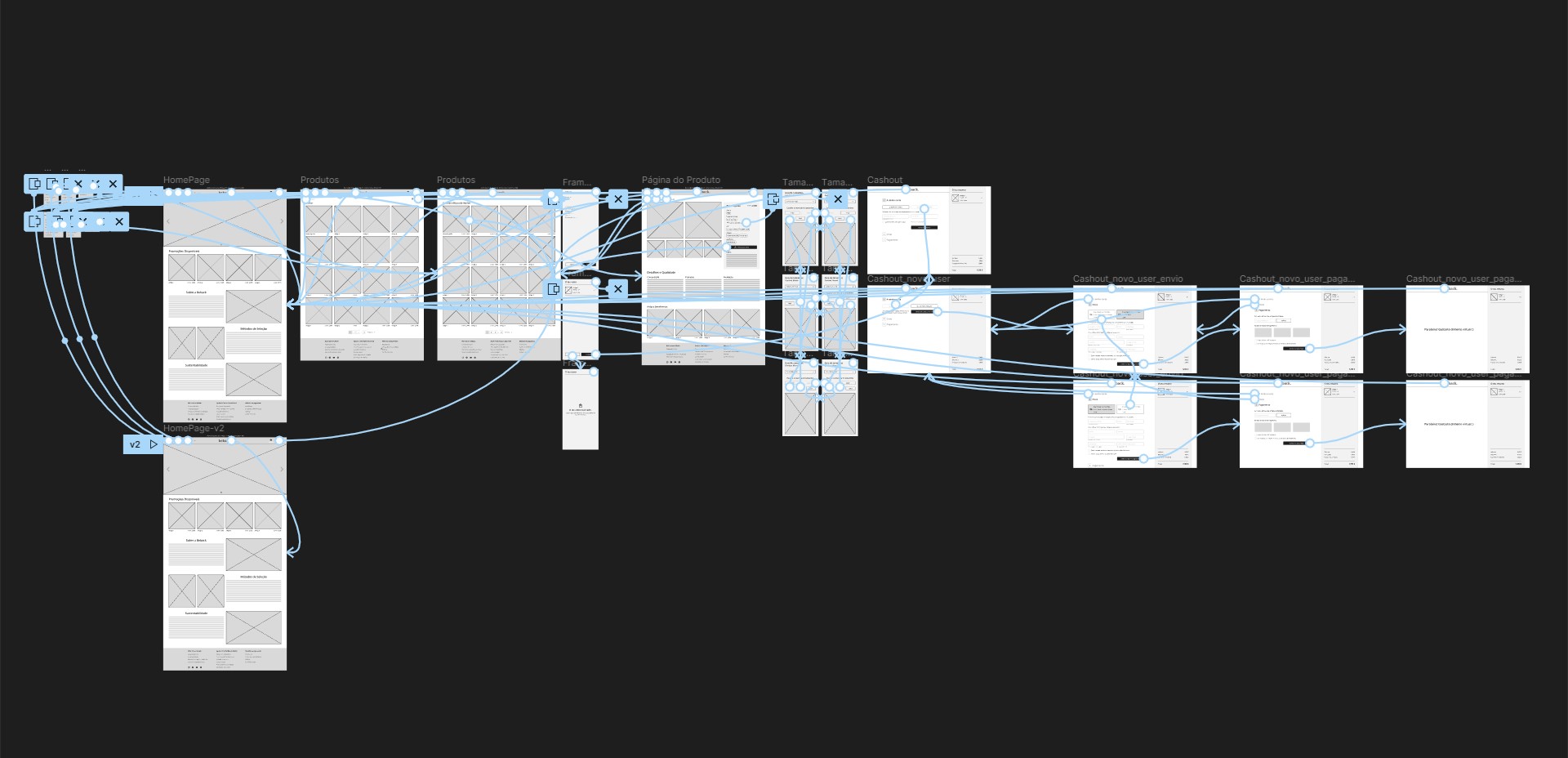
  • The project duration and deadline was 1 month.
  • The data collected during the Research and Testing is based on articles and real users.

Goals

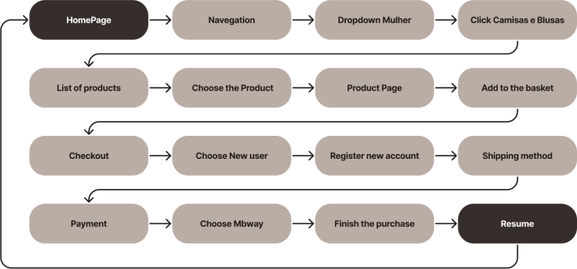
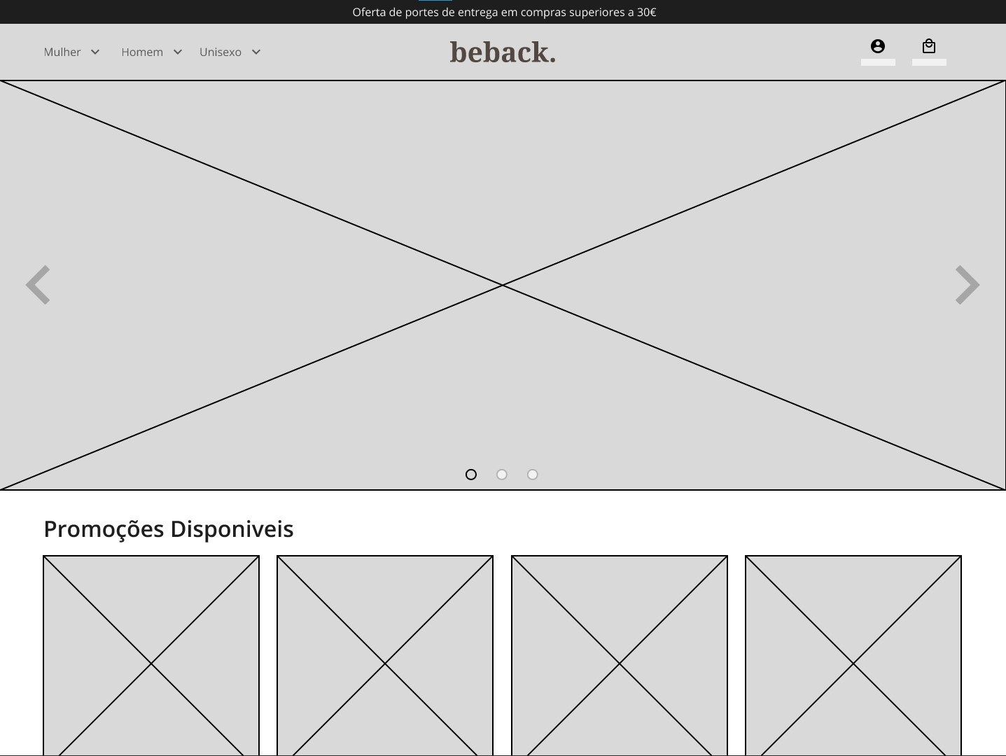
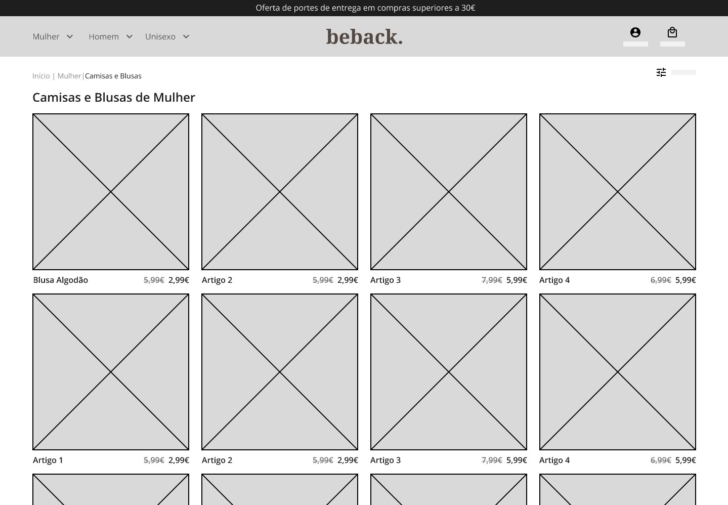
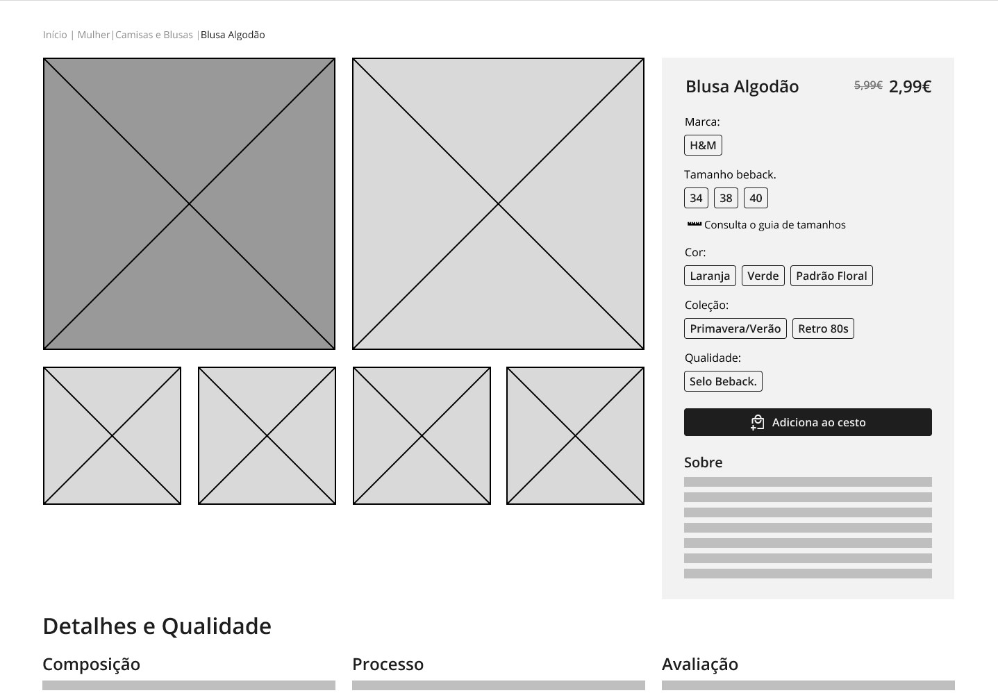
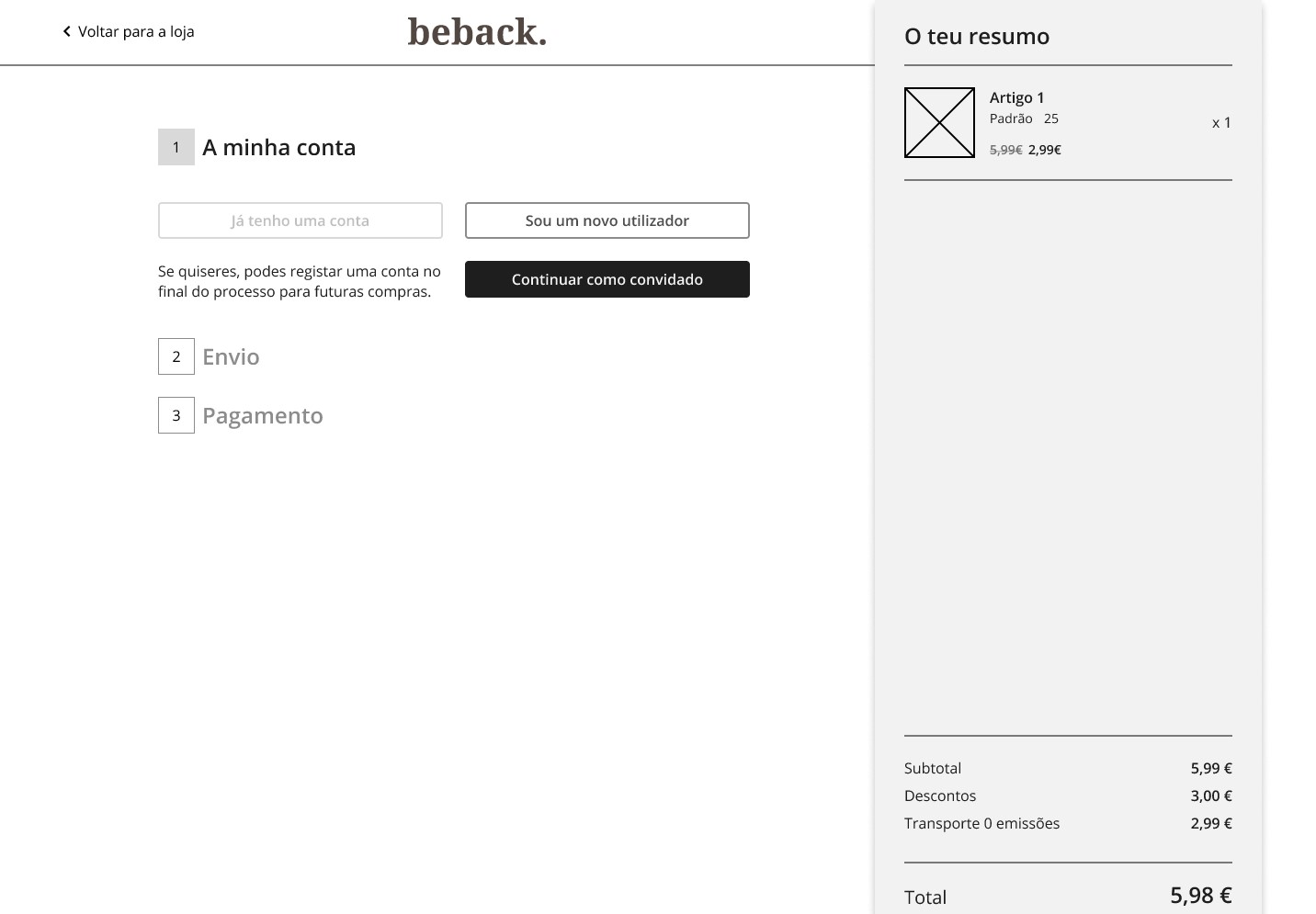
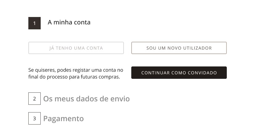
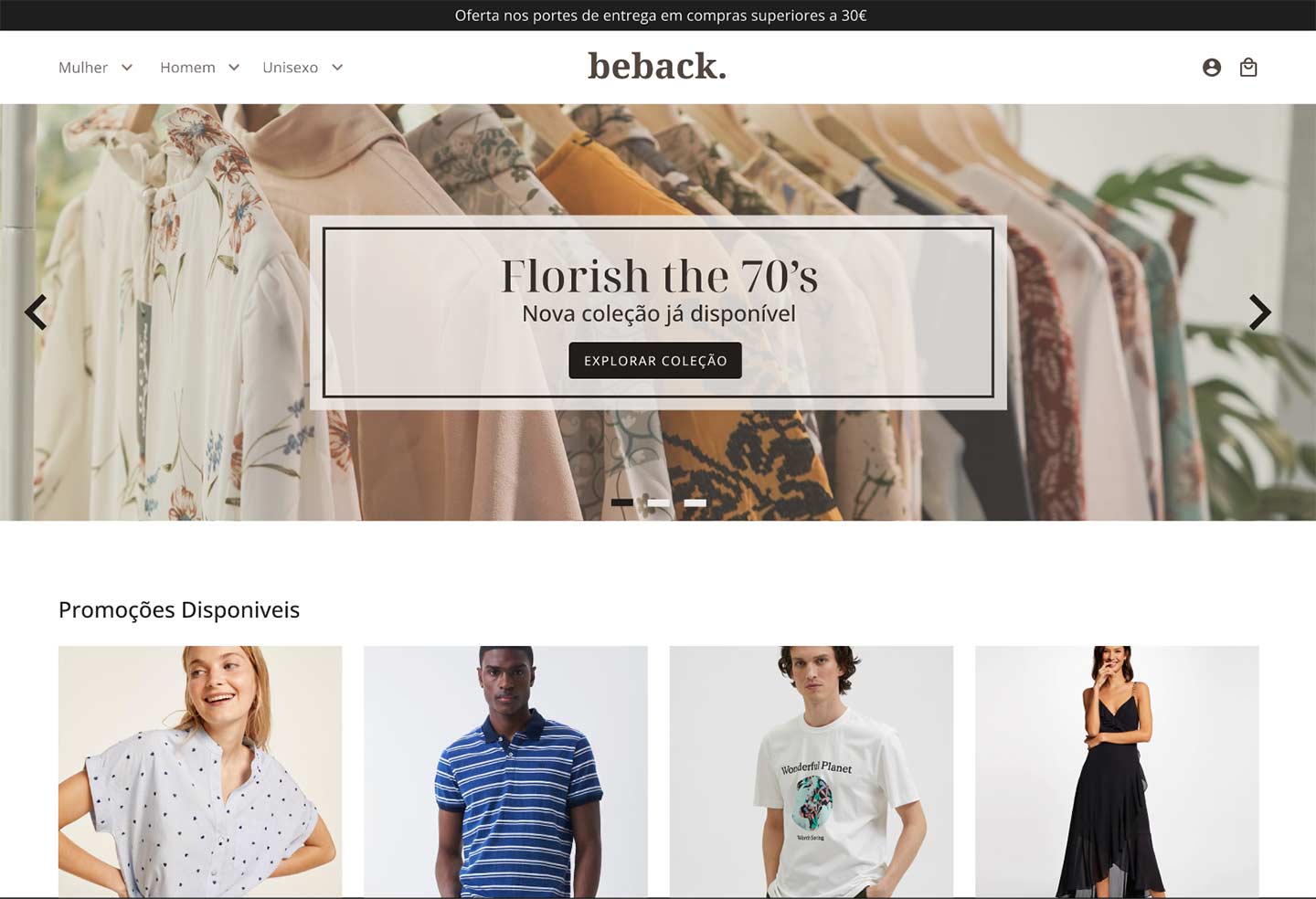
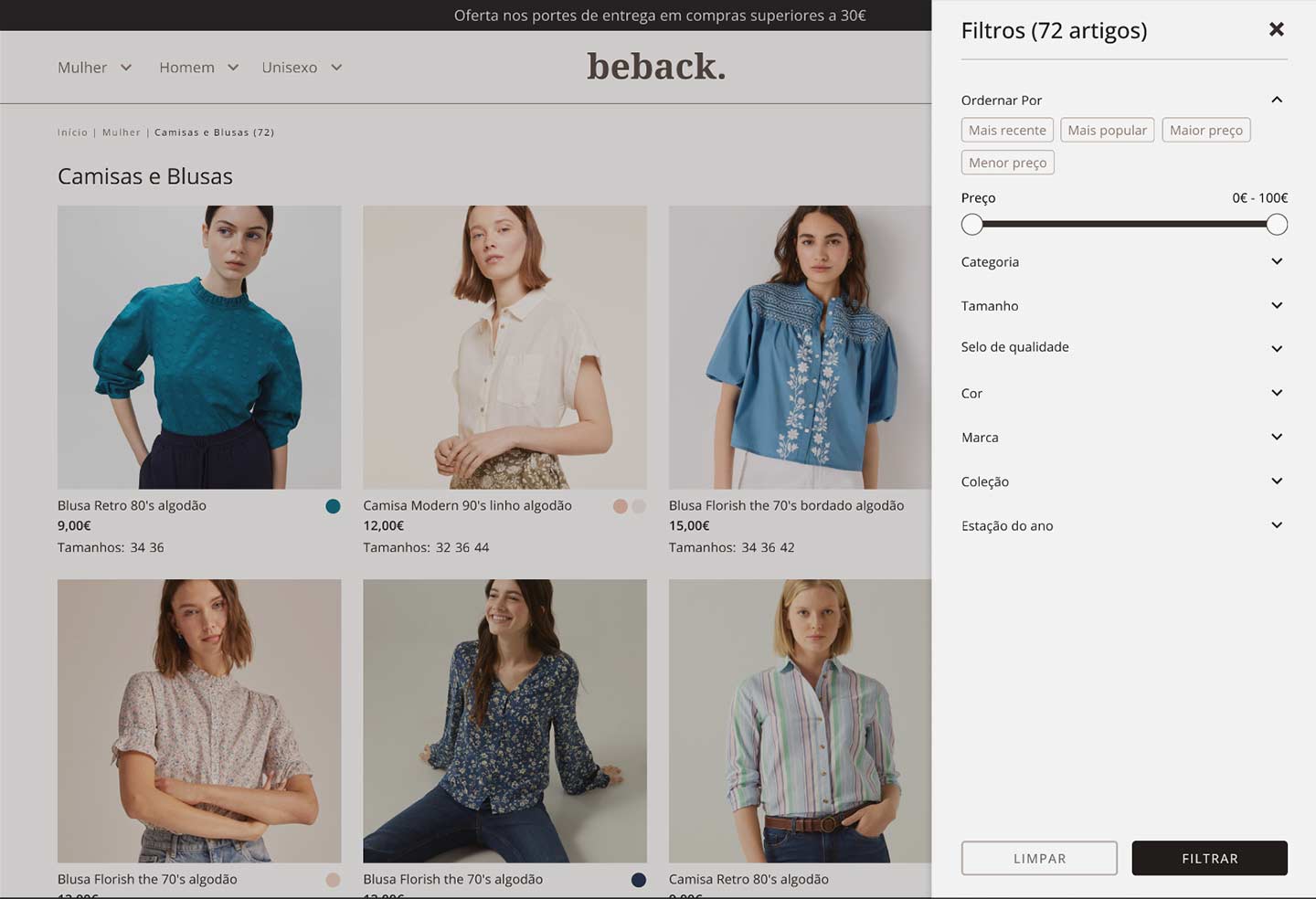
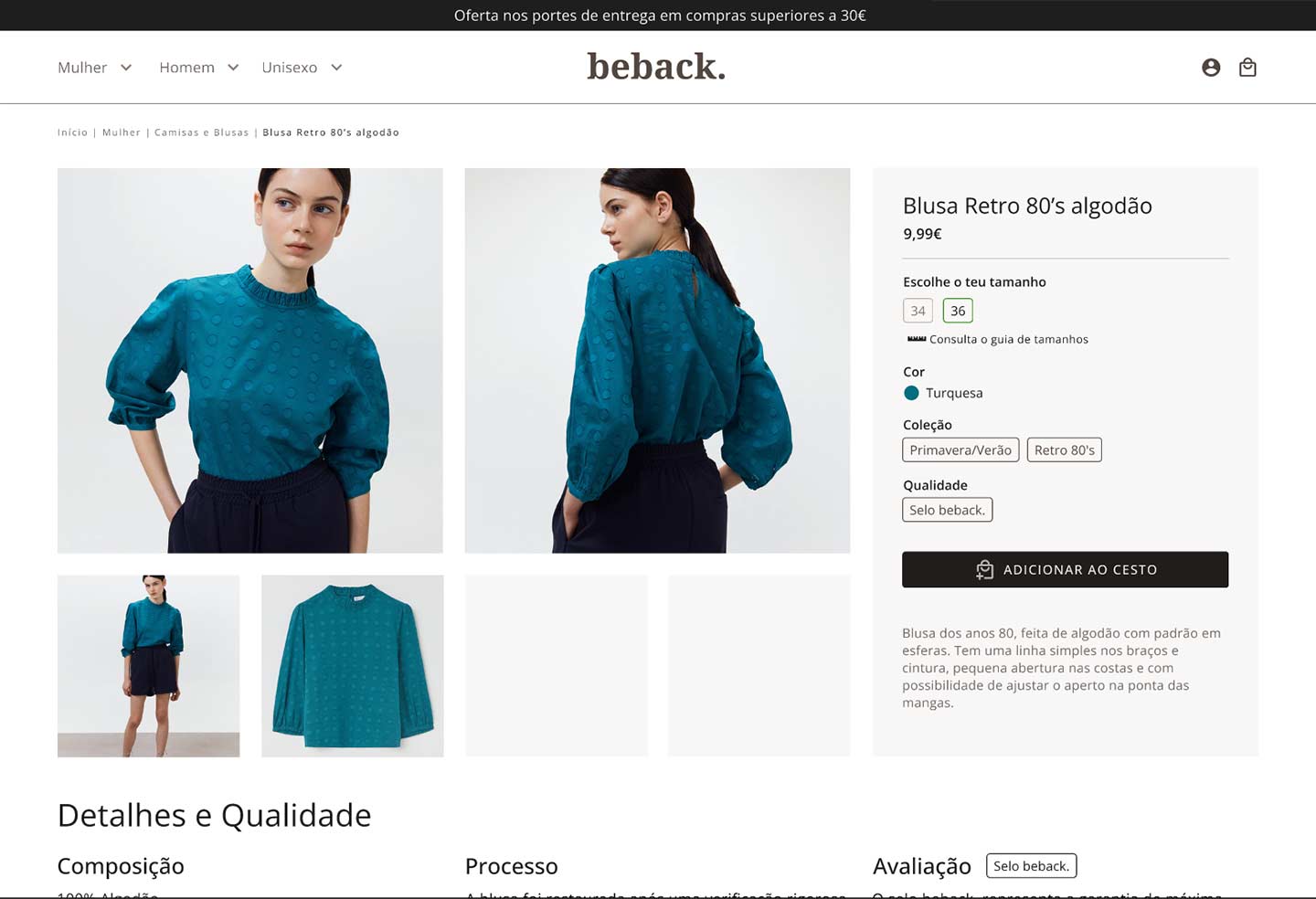
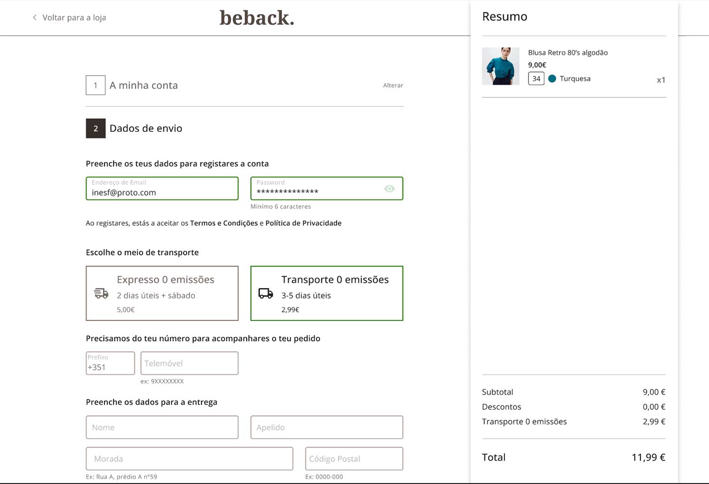
  • Create a website that conveys the look & feel of the brand and allows users to purchase second-hand clothes in a simple, easy and fast way.
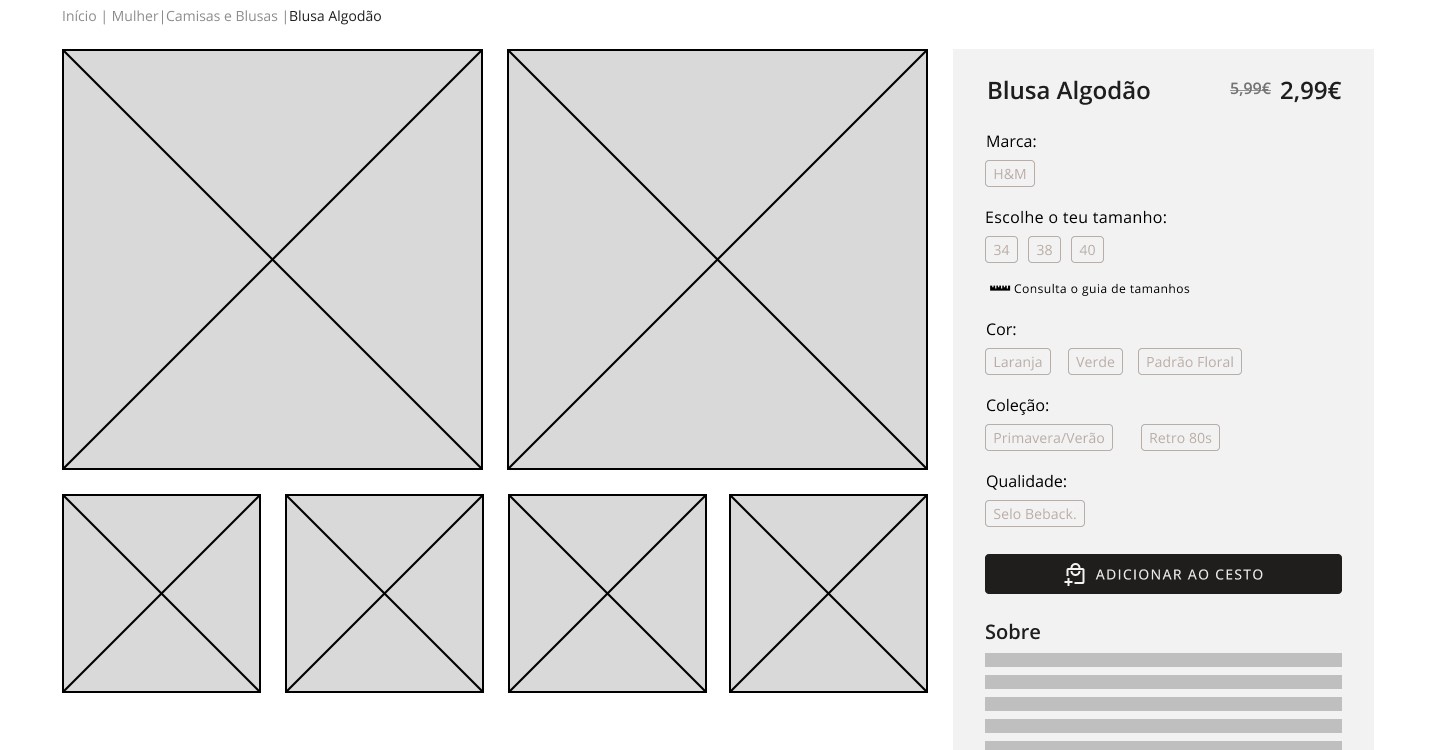
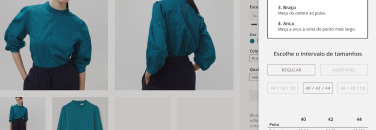
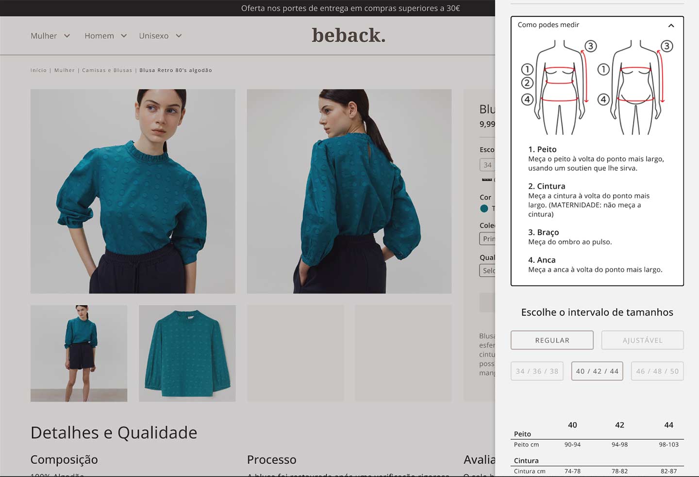
  • The user must be able to identify which size fits their measurements.
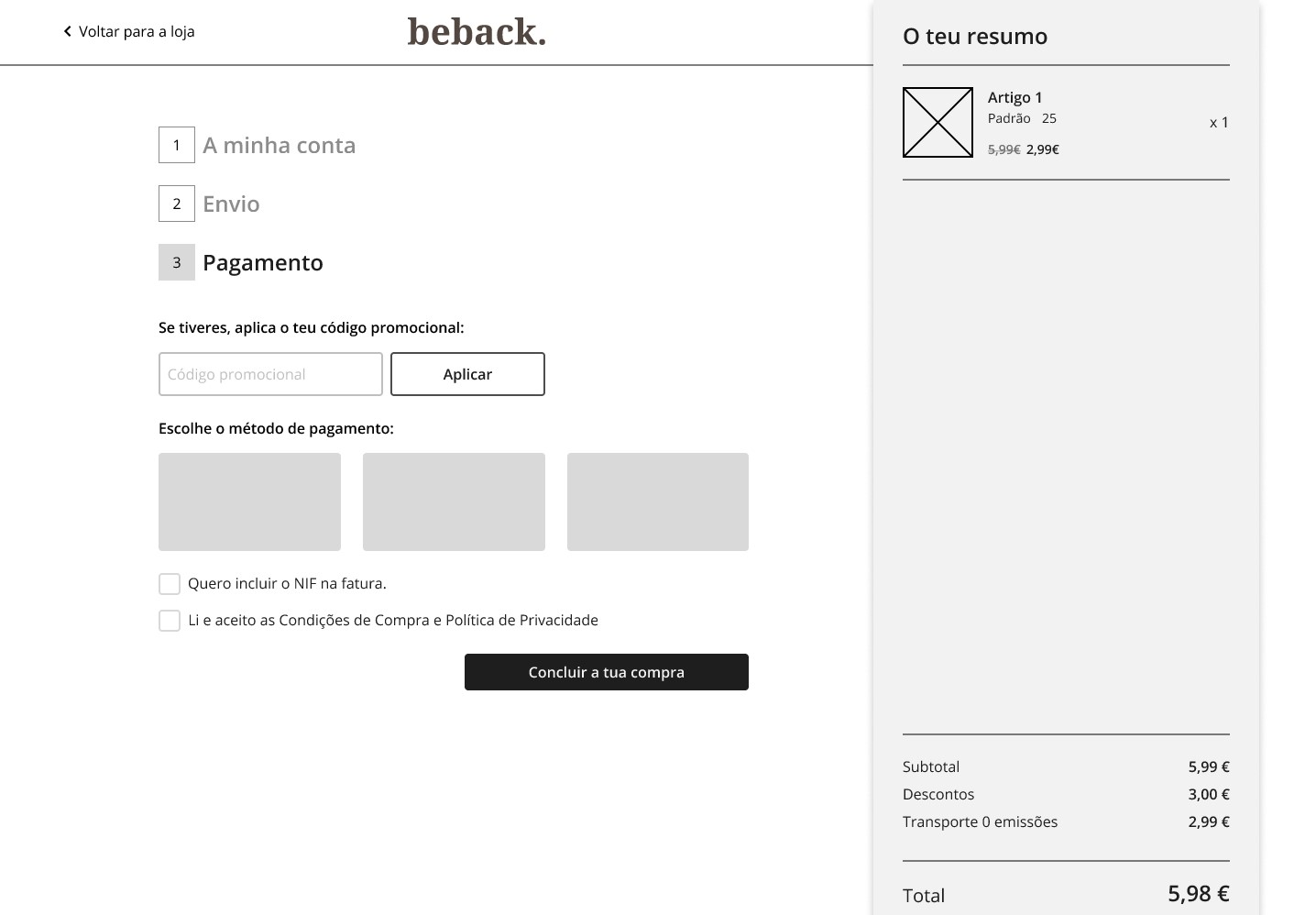
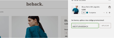
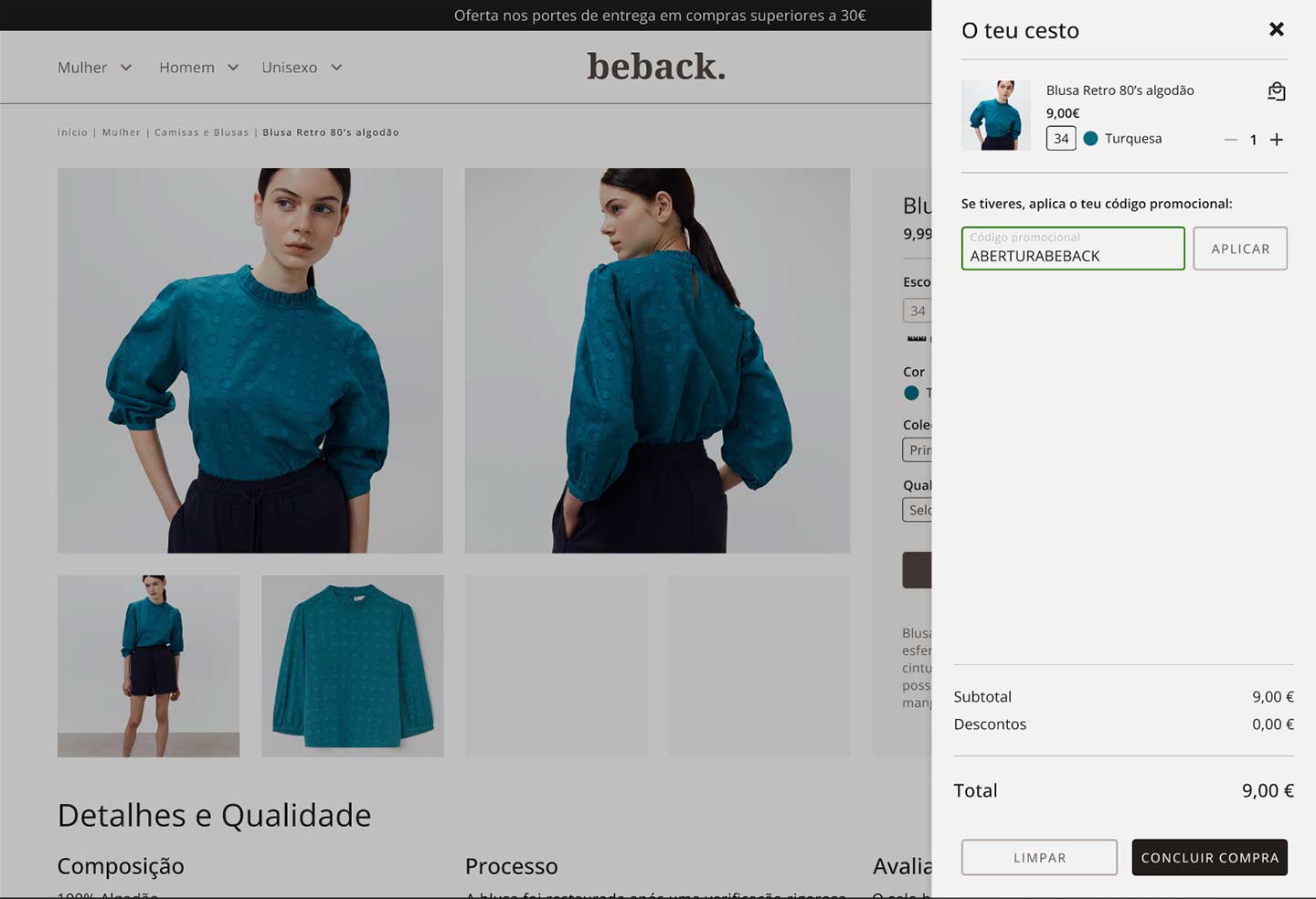
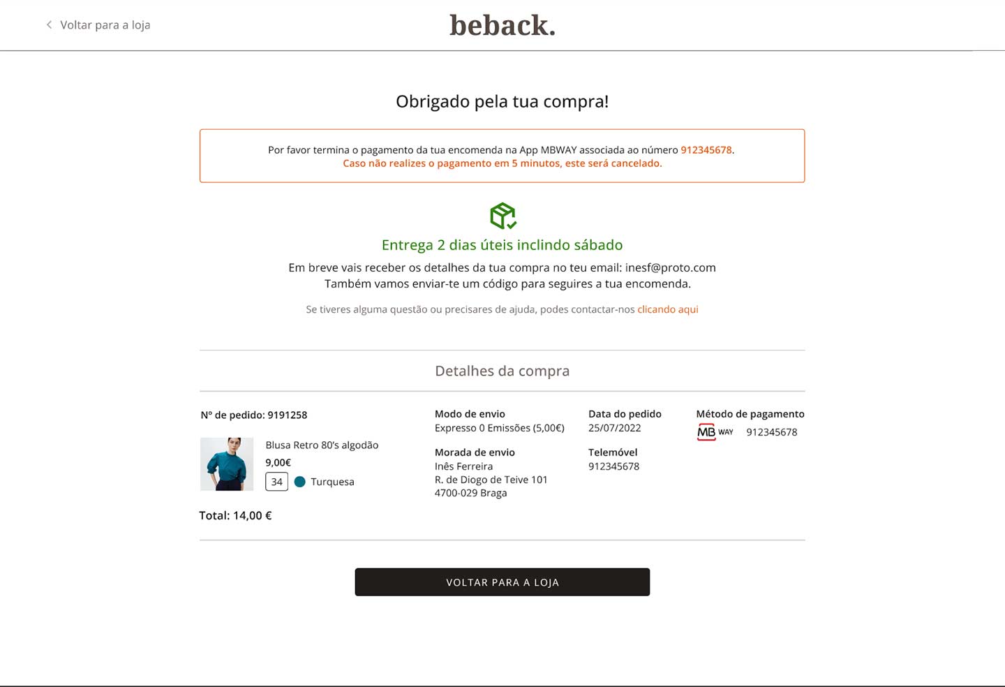
  • Possibility to apply a voucher code during the checkout.
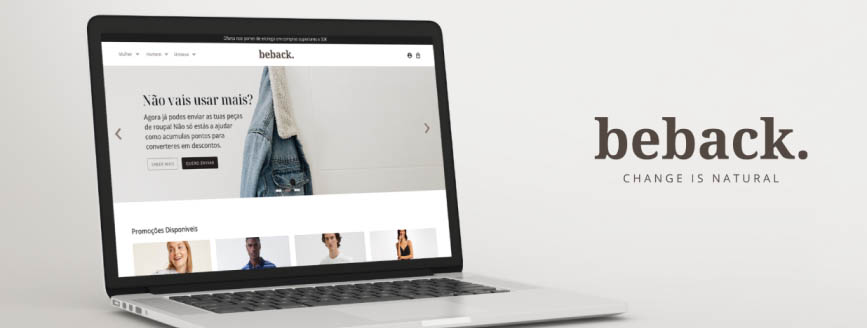
About Beback.

The brand's main objective is to promote the circular economy and thus prolong the life cycle of clothing and contribute to reducing the ecological footprint, first in Portugal and in the future Internationally.

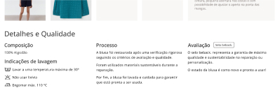
The main selling items will be second-hand clothing and even previous unsold collections from shops or workshops, each item will have a quality control criteria before heading to the online shop.

Research

Market Analysis

To help doing a good Analysis, I’ve started doing a Business Model based on the Brand and Briefing.

After that, I’ve focus searching about the secondhand market but the data in the articles were all either based in US or Europe except a single article about Portugal which wasn’t clear with the statistics.

I’ve decided to write some questions and use the google form to have better insights, to know the user choices and whys and to start gathering data to help me in the Define Phase.

Competitive Analysis

I’ve also decided to search for similar businesses online shops to know how they are doing, why they are successful and what’s unique about them, I end up with 2 direct and 1 indirect competitors.

Mão Esquerda

Direct competitor

  • Established in 2014 and it has a physical shop.
  • Unique Vintage second-hand fashion styles.
  • Wide range of accessible prices.
  • The website online shop is not working.
  • It doesn’t have a size guide or a FAQ.
  • Social media pages are their only products advertisement.
Retry

Direct competitor

  • It has the possibility to buy and sell.
  • Unique clothing quality classification.
  • Free shipping on purchases over 49€ with 48h deliveries.
  • The website doesn’t have a FAQ.
  • It doesn’t have a detailed size guide.
  • The prices are questionable, some are 20€ others are 200€.
Springfield

Indirect competitor

  • Various shops across the country and online shopping.
  • Has customer card to win discounts based on each buy.
  • Their Reconsider collection focus on sustainability.
  • Limited seasonal clothing collections.
  • Prices can be high without discounts.
  • No possibility to deliver or sell second-hand clothes.

Google Form Analysis

After leaving the survey up for a few days, it was time to translate and understand the answers I got, there were some surprises and I end up shouting a “wow.. that was unexpected!”, this part was really exciting and fun!

I also helped me to understand why there wasn’t enough trust in the second hand market, which also offers an opportunity to gain the user trust with the market and specially with Beback.

This are the most relevant answers which made the Define phase fun, exciting and I’ve also learned a lot at the same time! The survey made it feel like a real project as well, even though I had 19 responses, I’m glad I choose to do it.

Ps: Did you know that a T-shirt takes 2700L of water to produce?

68% are Millennials

32% are Gen Y

(N-19 responses using Google Forms)

“My damaged clothes are..”

42% sent to the trash

37% try to repair

(N-19 responses using Google Forms)

47%

“I buy second-hand clothing”

(N-19 responses using Google Forms)

60%

“I would buy if it was easy to find what I want”

(N-10 responses using Google Forms)

Knowing the users

I’ve also had the opportunity to talk directly to some users to understand the why’s I had and I’ve found out some common pain points mainly between people who never bought second-hand. One of the most important aspect was the lack of transparency:

“How do I know if am I overpaying?”

“What if the clothing isn’t washed correctly?”

I don’t trust second hand clothing”.

“What if I the clothing doesn’t fit me?”

With these questions in my mind, I already had some material to work in a solution to increase the transparency and the users trust.

During the Design phase, I also had some questions related to the website menu categories and how would they want to use size guide chart.

I really wanted to do a Workshop with the users to help me wih the categories, however time was getting short so I end up doing an A+B usability test later to help me decide.

I had the opportunity to openly discuss about the size guide however, the main pain points were the small size differences between all clothing and inaccurate charts and made some people not confident to buy online.

Say hello to the personas!

A photo representing the persona

Inês Ferreira

Age: 23

Location: Braga

Status: Single

Education: H. R. Management Degree

Occupation: Student and Part-time worker

About: I’m currently studying and working in a part-time to pay the student loans.

Despite my filled schedules, I still find enough time for my hobbies and to help my friends.

I like fashion but can’t afford to spend a lot of money, it’s hard to find a shop with affordable prices and accurate sizes.

A photo representing the persona

Tiago Araújo

Age: 35

Location: Aveiro

Status: Married

Education: Masters in Architecture

Occupation: Unemployed

About: I recently got unemployed because the Covid-19 situation, but I’m looking for a new job.

I care about nature therefor I try to be responsible with my lifestyle.

Donating and trading clothes is something I always did because I care about the sustainable market, but right now clothing with low prices are mostly welcome as well.

User flow diagram

I defined a path for the user to follow, this will help me to wireframe the essential pages and the user testing

image of a user flow diagram

Wireframe

User Testing

Usability Test

After doing usability tests with 3 users, I noticed a severe heuristic that stopped the checkout progress during the choice to continue as a guest or create an account.

Image showing the account creation

When clicking the “new user” button, there’s the creating account instructions on the left and a button to continue as a guest on the right.

  • The users didn’t notice the account could be created after the checkout process, they were expecting a button to create an account. This was a severe heuristic since it stopped the progress.
Image showing product tags

Product information with the tags and size selection with the same light color.

  • Some users tried to click on them and expected something to happen.

Important features

Considering the usability test feedback, their pain points and how they felt with the solutions presented, I began to turn the wireframe into a high fidelity prototype.

Image showing the product details

Detailed information about the product, the product process and what represents the quality evaluation/seal.

  • During the final usability test, the users really liked this feature and made them feel more confident with the buy they were about to make.
Image showing the voucher being applied

One of the goals was the possibility of using voucher codes during the buy process, I’ve added that possibility before and during the checkout.

  • The users easily understood and use their voucher code, there was also a positive reaction since they could see how much they can save.
Image showing the clothing size chart

Instructions how to measure and an unique size chart, the size number is selected by measuring the clothing during the quality process phase.

  • Users were able choose the size and follow the measurements without problems.
Image showing the account creation

The user now has clear options to create the account or continue as a guest.

  • Users were able choose continue as a guest as part of the user flow and they weren’t confused as before.

Final Usability test

After finishing the prototype and doing a final user test, the overall feeling was positive, they felt the shopping process was easy and the website felt fresh

The experience was great and they would use the website if it would become a real project.

Hi-Fidelity Prototype

Final Result

Figma Prototype

Final Insights

Presentation and Feedback

The presentation went great, I’ve felt I made a solid project as well. There was positive notes:

  • The project has a good research and I applied the methodologies covered during the course.
  • Using real users during the research, testing and apply their feedback is a big plus.
  • It has a good UI organization and hierarchy.

And negative/improvement notes:

  • Category page and filters menu are missing the total number of products, this will improve the user experience.
  • The password input filed is missing the option to show or hide what we write.
  • Field absence to include the NIF at checkout. There’s an option to add but there isn't an input field to type the number if the box is checked.

Evaluation and Final Notes

The project was evaluated with a 16 out of 20! *happy sounds*

This project was amazing to do! I’ve learned a lot about second hand market and I tried to make it as realistically I could.

I’ve also made some mistakes such as time management or missing important questions in the survey and hopefully I can avoid them in the future.

After the presentation I changed the final design based on the feedback but I couldn’t do other user testing.

I can’t finish the notes without mentioning how important the users were during the project. From Research to the High Fidelity Prototype, they helped me to define what was a good experience, change features that weren’t working and made me confident I had made good decisions.

A big shoutout to the users, this project wouldn’t be the same without them.